Creating a Responsive Image Gallery with 19 Lines of CSS (and Flexbox)
Images are an ass to deal with. Unlike beautiful, reflowable text, you can’t just get part of your picture to move to the next line. Instead you have to write a bunch of weird rules that can result in having images stretched beyond their means, or shrunken in to obscurity.
Fear not.
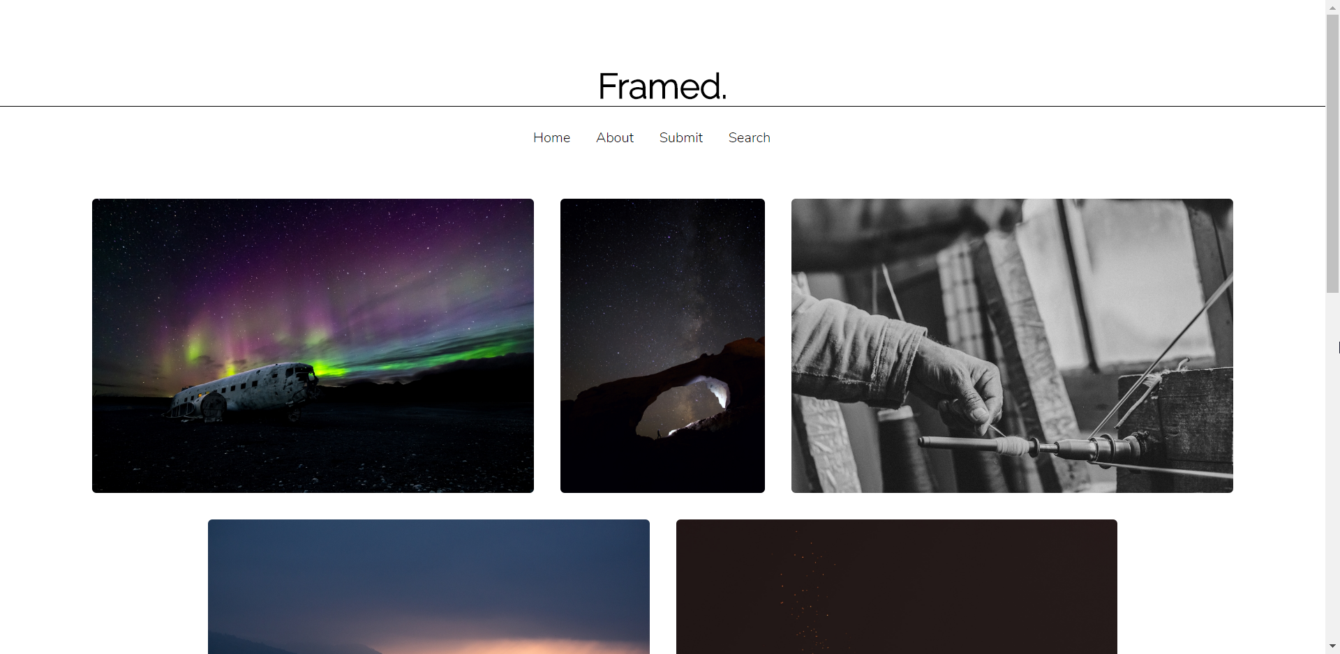
By the end of this (shortish) blog post, you’ll have the means to create a image gallery that can handle any device size and images of any dimension. With a few of your own styles, you can get a site to look like this in about 20 lines of CSS.

TL; DR
- Use Flexbox to control the flow of your content. It’s awesome. And no one uses IE8 anyway right?
- Set a
max-heightproperty for your images, else they can take up some serious real-estate- Use
vhto do this. It scales better than other units.
- Use
object-fit: cover;helps your image scale nicely, no matter what size box it’s in. You may lose some content around the edges though.
Without further ado let’s get on.
Writing Your Markup
You have three major components in an image gallery:
- The gallery container
- The container the image sits in (also known as the frame)
- The image itself
- The container the image sits in (also known as the frame)
This allows you to control each of the components individually if required. Here’s how I wrote the markup.
Here you’ve got gallery which is the whole gallery content. Then gallery-block which controls each element (looking back, should have called this “frame”). Then the image which has the class gallery-image.
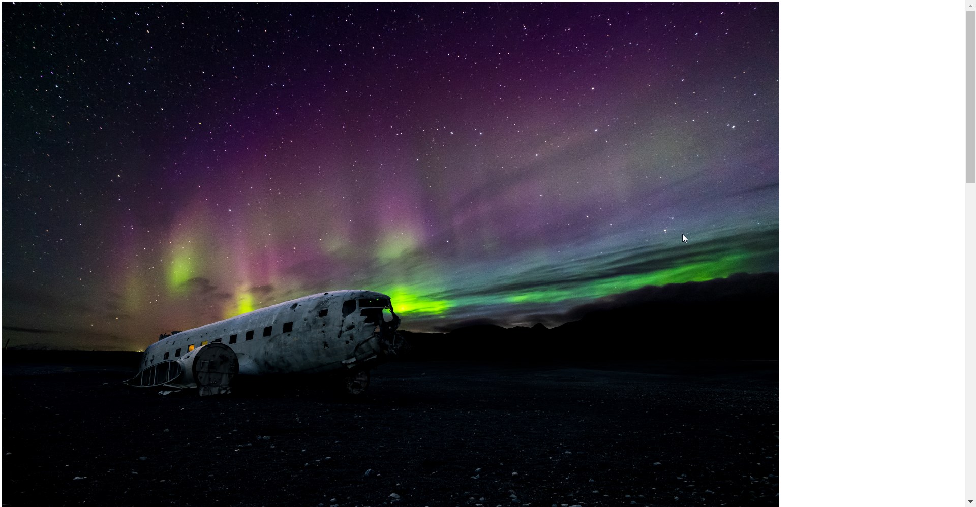
Because I used massive images, mine looked like this. But you may have used smaller pictures. Fair play.

CSyeS! Or; Flexbox, how I love thee.
Flexbox is a CSS layout engine for those of us who don’t need to worry about Internet Explorer 8 (so, anyone outside the NHS…). It’s great because it takes away a lot of the pain of alignment, overspill, wrapping and so on. There’s a great chapter in Responsive Web Design with HTML5 and CSS3, Second Edition that deals with Flexbox in detail or you can try the w3schools.com site for more info. For now, you’re just going to use it and see what happens.
Styling the White Cube
Art galleries used to be absolutely full of images on every wall. That changed in the 20th century, when galleries started to use white space to create a focus on fewer images. These galleries are known as the “White Cubes”.
Now that I’ve explained how clever my heading is, let’s see Flexbox in action. Rather than explaining it in text, the comments will help you out.
That’s the first step done. Your content knows to be flexible, knows which way to be flexible, and where to line up.
Styling the Frame
This is nice and simple. You just have to tell your frames that they need to have a little margin between each one, and that they should take up a maximum of 100% of their available space. In fact, this bit is so small I won’t use a Gist
.gallery-block {
	margin: 1%;
	max-width: 100%;
	display: flex;
}
The display: flex; here is probably not strictly necessary. But it does tweak something, for certain, so I left it in!
Styling Your Image
Lastly, you need to style your image. Paint your canvas. You know. Make your pictures look good.
The key thing here is the height. You can use any unit to control height. I like vh because it’s linked to the height of the device accessing your site. I used a unit rather than height: auto because working with huge photographs on a big desktop screen makes them uncomfortably large. Also, I wasn’t convinced that I was doing it properly, so I chose to tactically ignore it.
Combined with your other styles, eventually you get images that look like this:

Final Flourish
That’s really all that there is to it. For my final site that you saw in the first picture, I added some simple elements to my HTML. The full site is here: Framed.
One thing that I also added was a mobile rule that forces a full width for mobile phones. This is because there was some really sad looking white space on my portrait-shaped images. You can do that as easy as
@media (max-width: 740px) {
  .gallery-image {
    width: 100%;
  }
}
And now you have a full responsive image gallery ready for you to take ill-framed black and white pictures of your sleeping dog. You can use Flexbox for far more powerful solutions than I have here; we’ll save that for another post though.